Exploratory data analysis
What 7 years of SDN match posts say about the OMFS match
Every January, oral surgery applicants post their stats to the Student Doctor Network (SDN) “Official OMS Match Results” threads once results are released. Those threads are the closest thing the specialty has to a public dataset. This page pulls together 7 cycles of self-reported data and asks a simple question: among people who matched, how do objective metrics such as CBSE score, class rank, research, and # of externships predict the OMFS program they matched at?
Read this first: what this data can and can’t tell you
Every number below comes from people who chose to post after matching. There is no comparison group of applicants who didn’t match, and the posts skew toward “if I could do it, so can you” success stories. So nothing here describes whether someone matches — only how metrics relate to where matchers ended up. The sample size is also non-representative (N=111 over 7 years).
How the data was collected
The seven “Official OMS Match Results” threads (2020 through 2026) were read in full and coded into a structured dataset with variables such as program length (4-year single-degree vs 6-year dual-degree/MD), CBSE score, class-rank percentile, number of externships, research intensity, and the application funnel (programs applied to → interview invites → interviews attended → programs ranked). Purely conversational posts were skipped.
Program length was coded only when a poster stated it explicitly (“4-year”, “6yr”, “dual-degree”) or where it was unambiguous; otherwise it was left blank. Research was coded on a four-level ordinal scale (none / light / moderate / heavy) from the described publications, posters, and projects.
Disclaimer: CBSE scoring changes
The CBSE has been reported on several scales over the years: an older 2-digit scaled score, a 3-digit USMLE-aligned score, and the current Equated Percent Correct (EPC). To make seven years comparable, every score was converted to EPC using the official NBME equivalency tables — the old-2-digit → EPC table and the 3-digit → EPC table.
1. Does CBSE score differ across program length? → YES!
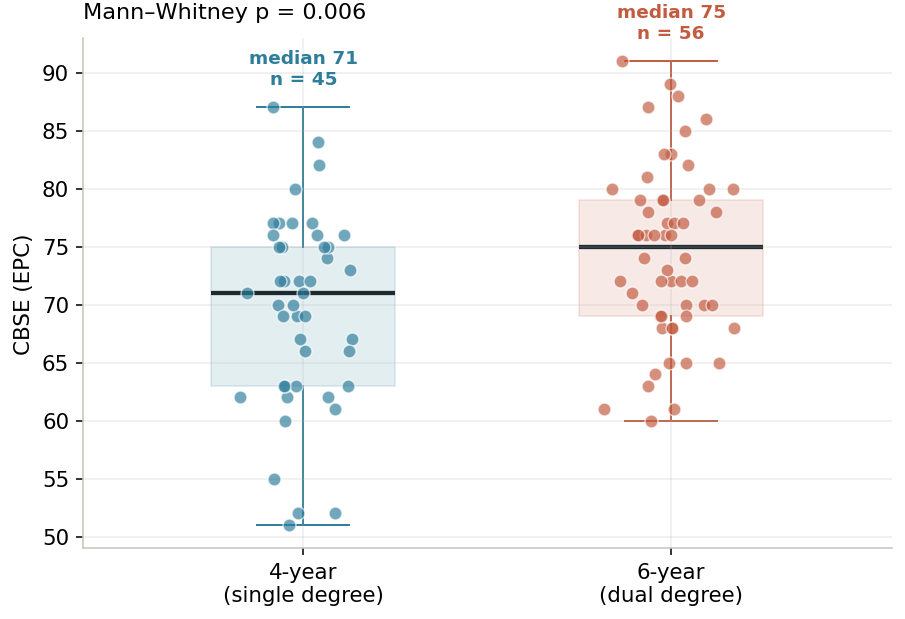
The recurring belief in the threads is that 6-year (dual-degree/MD) programs demand a higher CBSE than 4-year programs, because the affiliated medical school screens on it. Pooled across all seven cycles, the data supports this. Six-year matchers have a higher median CBSE (75 EPC) than 4-year matchers (71 EPC), and the difference is statistically reliable (Mann–Whitney p = 0.006).
2. Does a higher CBSE score mean more interviews? → YES!
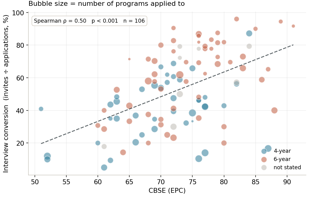
If the score does one thing clearly, it’s convert applications into interview invites. Plotting CBSE against interview conversion (invites ÷ applications) gives a Spearman correlation of ρ = 0.50 (p < 0.001) - this is the strongest and most reliable relationship in the whole dataset! The data are consistent with the advice repeated in every SDN thread: the score gets your foot in the door, and everything after the interview is about fit.
The bubble sizes are telling, too: several low scorers still matched by applying to 40–50 programs, using sheer volume to compensate for a lower per-application hit rate.
3. Does more research experience mean more interviews? → YES!
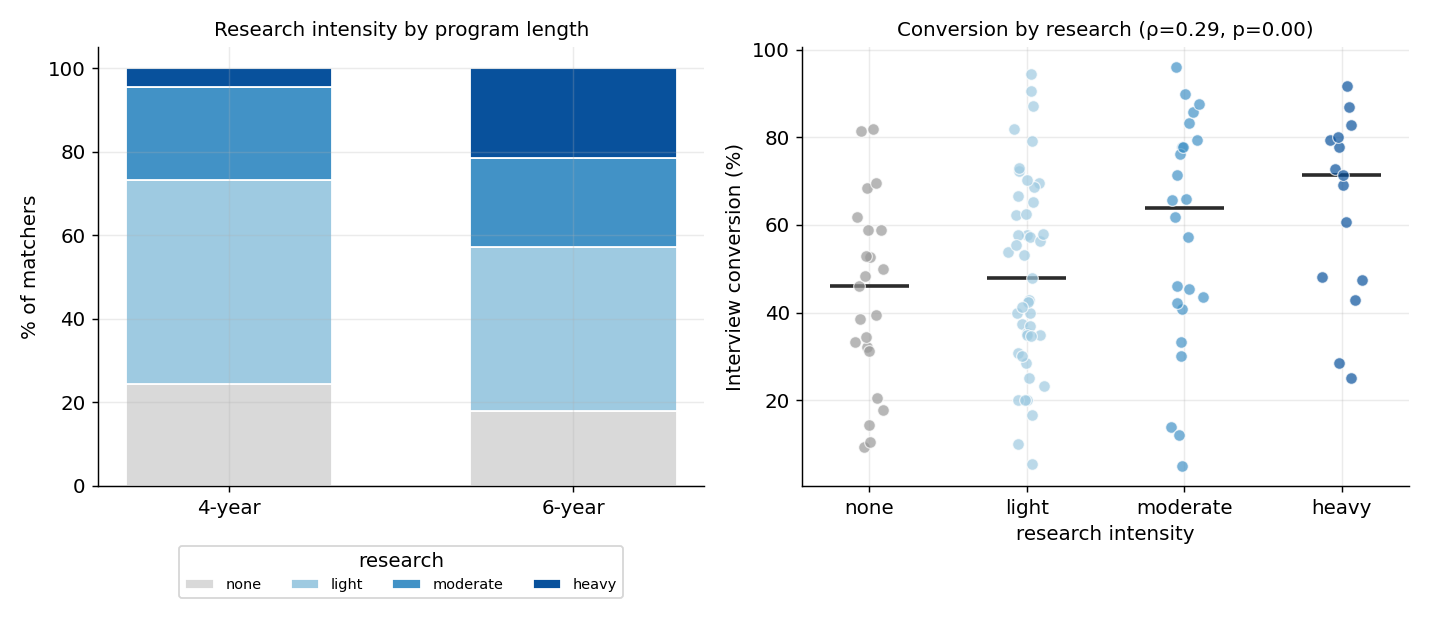
An applicant’s research intensity also tracks with interview conversion (ρ = 0.29, p = 0.002): median conversion climbs steadily from 46% (no research) to 71% (heavy research). Six-year matchers also carry more research than 4-year matchers — the “heavy” band is visibly larger for 6-year programs — consistent with academic medical centers valuing it.
Note that research and CBSE score are essentially uncorrelated (not shown, ρ = 0.12, not significant), which means that research looks like a genuinely independent path to invites rather than a proxy for test-taking ability (though please note the disclaimer about reporting bias and low N).
4. Does doing more externships mean more interviews? → Yes, but likely confounded
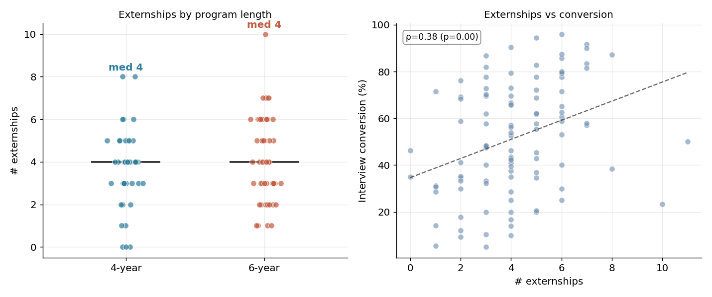
More externships track with better interview conversion (ρ = 0.38, p < 0.001), though the median count is identical for both tracks (4 each). However, interpret this with caution: people extern where they want to interview/match, so this trend may reflect a targeting strategy and not causation. Nevertheless, it remains the single most-emphasized qualitative theme across all seven years — nearly every write-up credits externship relationships and letter-writers over raw numbers.
5. Does a higher class rank mean more interviews? → YES!
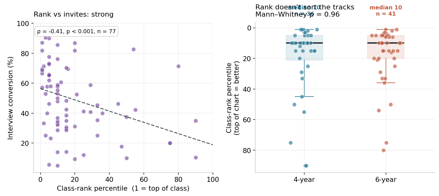
Two conclusions can be made about class rank from our data. First, class rank predicts interview invites (ρ = −0.41), but note that only 77 applicants in the dataset self-reported rank. Finally, it does not distinguish four- from six-year programs at all (p = 0.96). So rank won’t tell you which track you’re headed for, but it absolutely moves your invite count.
6. Accounting for all factors, which matter most in predicting interview invites?
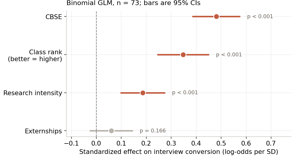
Sections 2 through 5 each looked at one predictor at a time, which can’t tell us whether they’re four separate signals or one signal showing up four ways. To separate them, we can put all four into a single model of interview conversion (a binomial GLM, standardized so the effects are directly comparable).
Among the 73 applicants who reported everything including class rank, all four predictors point the right way, but they don’t matter equally. CBSE is the strongest, followed by class rank, then research — and each holds up independently of the others. Externships, the fourth, shrinks to non-significance (p = 0.17) once the other three are accounted for, consistent with the targeting confound flagged in Section 4: externing where you apply looks less like a separate lever and more like a reflection of the same applicant strength the other metrics already capture.
The headline is that CBSE, rank, and research are genuinely distinct levers — you could be lighter in one and buy back interview invites using another.
7. The application funnel
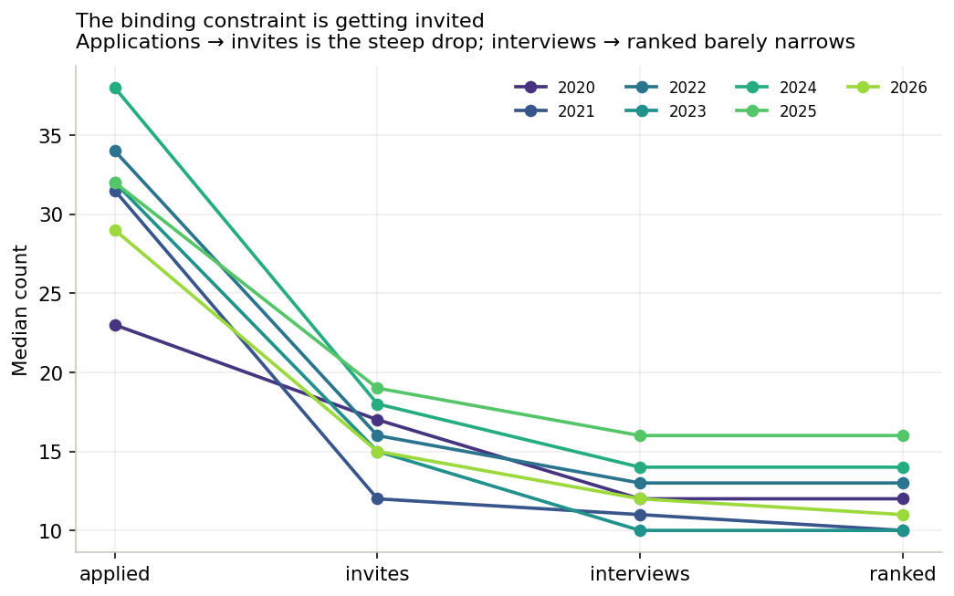
The attrition is overwhelmingly at the first step — applications to invites. Once applicants reach the interview, they rank almost everything they attend. In other words, for these matchers the binding constraint was getting invited, not converting interviews into a rank slot.
8. Does it help to apply to more programs? → YES!
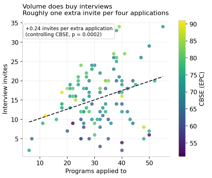
This is the most-asked practical question on the forums, and the data give a fairly clear answer: YES! Within the range people actually apply to, more applications buy more interviews. Controlling for CBSE, each additional application is worth about +0.24 interview invites (p = 0.0002) — roughly one extra interview for every four extra programs — with no sign of the returns flattening out. The catch is in the hit rate. Conversion falls as volume rises (ρ = −0.47), but that’s largely because the people applying broadest tend to be the ones with lower scores compensating for it (applications and CBSE are inversely related, ρ = −0.19).
9. How many match to their #1 choice? → About 50%, SDN inflates this value
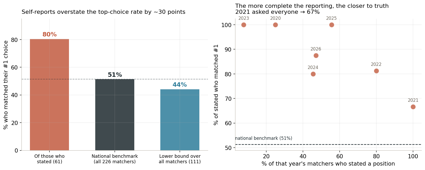
This is the section where the survivorship warning at the top matters most. Among matchers who stated their ranked position, 80% said they matched their #1 — but that number is badly inflated by who chooses to report. People who land their top choice are simply more likely to mention it.
Two things anchor the truth. First, the 2020 thread included official prior-cycle statistics for all matched applicants nationally, and there the top-choice rate is 51%. Second, the reporting bias is visible directly in our own data: in 2021, the SDN posting template explicitly asked for ranked position, and therefore reporting was more complete. As a result, the #1 rate fell to 67%, much closer to the true rate. Taking every matcher in the dataset and treating non-reporters conservatively gives a lower bound of 44%. Put together: roughly half of matchers get their top choice.
10. How does doing a post-DDS year OR non-cat affect your chances?
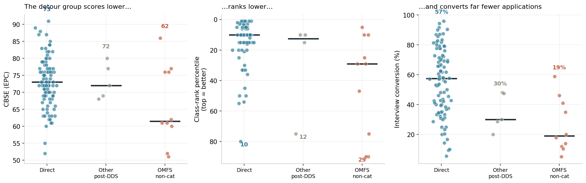
Applicants who did some post-DDS year (a GPR, AEGD, or private practice) before matching look only modestly different from those who went straight through. But applicants who specifically did an OMFS non-categorical year stand apart sharply. Their median CBSE is 61.5 versus 73 for the direct-from-dental-school group (p = 0.057), their class rank is meaningfully lower (p = 0.009), and they convert applications to interviews at 19% versus 57% (p = 0.0006), matching almost entirely (80%) into 4-year programs.
This is the closest thing in the dataset to a difficulty gradient: the non-cat route isn’t a preference, it’s what the harder road to matching looks like. The encouraging read is the flip side — it demonstrably works. These applicants started well below the pack on the metrics that gate invites, took an extra year, and matched anyway.
11. Do people match where they went to dental school? → It’s 50/50
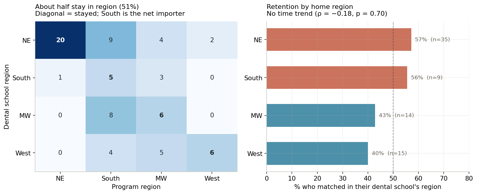
About as often as a coin flip. Among matchers whose dental-school and program regions are both known, 51% stayed in their home region — and there’s no trend over the seven years. The more interesting structure is in the flows between regions. The South is a net importer of residents (26 matchers landed at Southern programs, but only 9 came from Southern dental schools), drawing heavily from the Midwest. The Northeast is the most self-contained, with 57% of its dental students staying in-region. Staying versus leaving wasn’t associated with CBSE, conversion, or externship count — geography here looks like preference and program distribution, not a proxy for applicant strength. Practically: don’t assume you’ll train near where you studied, and calibrate how far to cast your net by where you’re starting from.
12. Are CBSE scores really rising every year? → NO
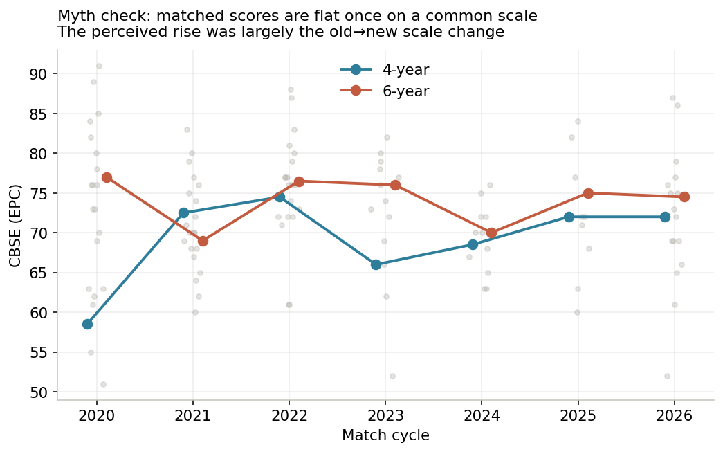
Applicants seem to think that matched CBSE scores are climbing every cycle. However, once every reported score is placed on the same EPC scale, it’s clear that this isn’t true — matched-applicant medians bounce around the low-70s (6-year) and high-60s/low-70s (4-year) without a strong upward trend. The perceived rise appears to be largely an artifact of the old→new scale change inflating the raw numbers people saw, not a real jump in matched performance.
Qualitative patterns
- “Score for the interview, personality for the spot.” The most repeated sentiment across all seven years: the CBSE screens you in, then fit and social skills decide.
- Letters and externships are the hidden currency. Multiple matchers were told their letters were decisive; many matched where they externed.
- The low end matches too — usually the long way. A recurring cast of applicants matched with CBSEs in the low 60s or near-bottom class ranks, almost always into 4-year programs and almost always after one or two non-categorical years.
- Rank where you want to go. The standard warning against ranking strategically “to match” rather than by genuine preference shows up every cycle.
Limitations
Beyond the survivorship and self-selection issues flagged at the top: program length is imputed for a handful of entries and blank where a poster didn’t state it; research and extracurricular coding involve judgment; and the 2020–2021 scores are the messiest, since some applicants took the CBSE before the scale change and self-converted. There is essentially no matched-vs-unmatched comparison here.
Dataset availability
↓ Download the coded dataset (CSV) · every row includes a note recording the raw score and its conversion path.